Cardinal Health Wayfinding Enhancements
This work was completed while working at Cardinal Health.
Project objective
In 2017, Cardinal Health made a large acquisition which added 23 product categories to their medical portfolio and increased their online presence internationally. With a significant number of new products being added to the existing website (from 800 to 1500 pages), a project was initiated to improve the product wayfinding experience of cardinalhealth.com. There were three primary focus areas: a primary navigation redesign, page template consolidation, and a category child navigation grid reconciliation.
Primary navigation redesign
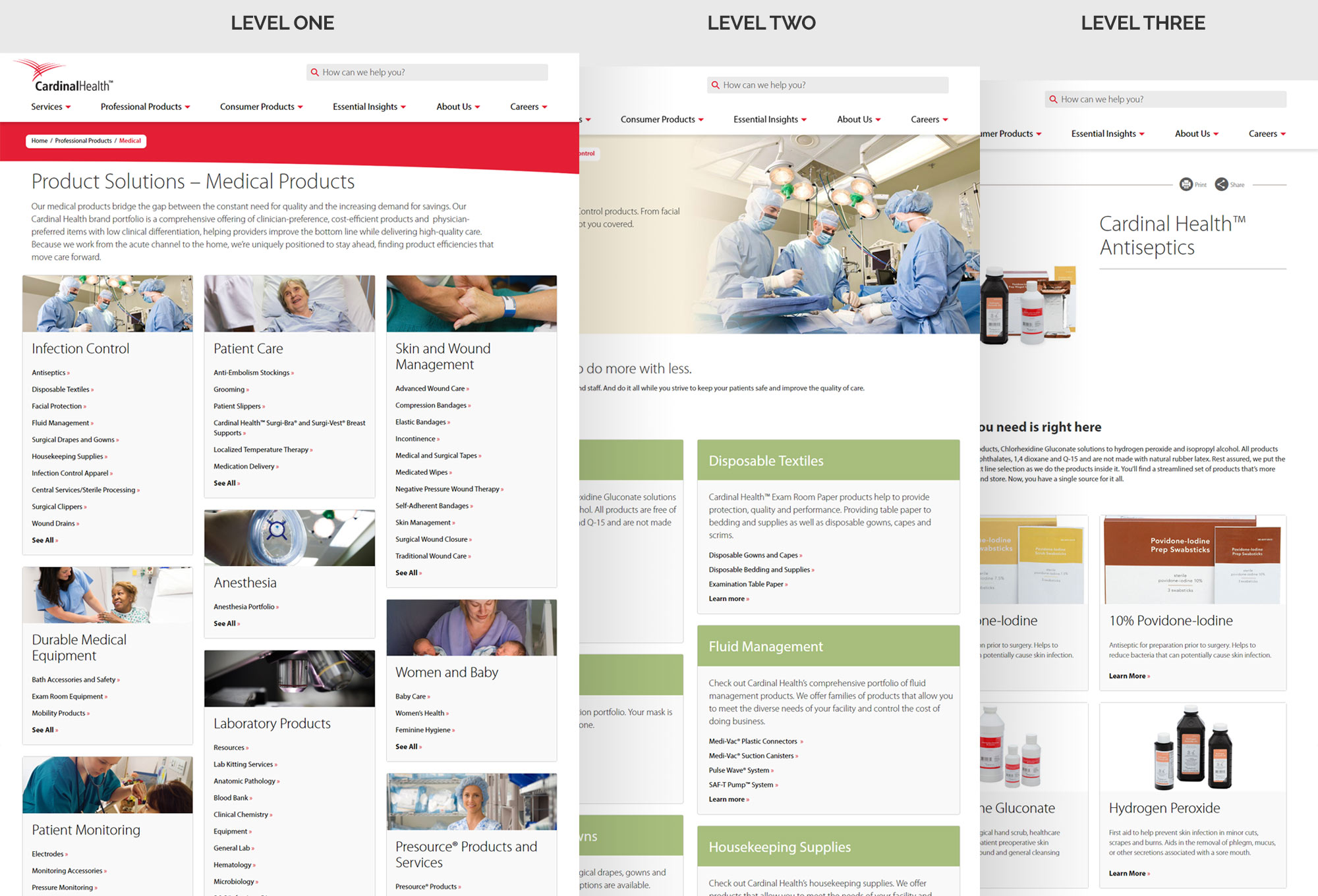
The original primary navigation of cardinalhealth.com was built to give users visibility into the first three of seven content levels, using a standard dropdown menu approach. This limiting of visibility into the lower level content was done by the original design team to ensure the users attention could be controlled on a focused set of items. This approach unintentionally limited the ability for the user to understand the full breadth of offerings available. Doubling the number of pages within the website would exasperate the navigation issues dramatically.
Before exploring how the primary navigation could be enhanced to better support the website, my team gathered a variety of data points to inform the process:
- researching best practices for presenting complex sets of navigation elements
- audit of navigation approaches used on competitor websites and similar sized organizations in other industries
- recent UI updates to ordering platforms within our organization which handled similar content
- an analytics examination of how users leveraged our existing navigation elements
Original and updated dropdown navigation
Result
Gained 2 levels of content visibility and increased items within individual levels from 5 items to 12
Page template consolidation
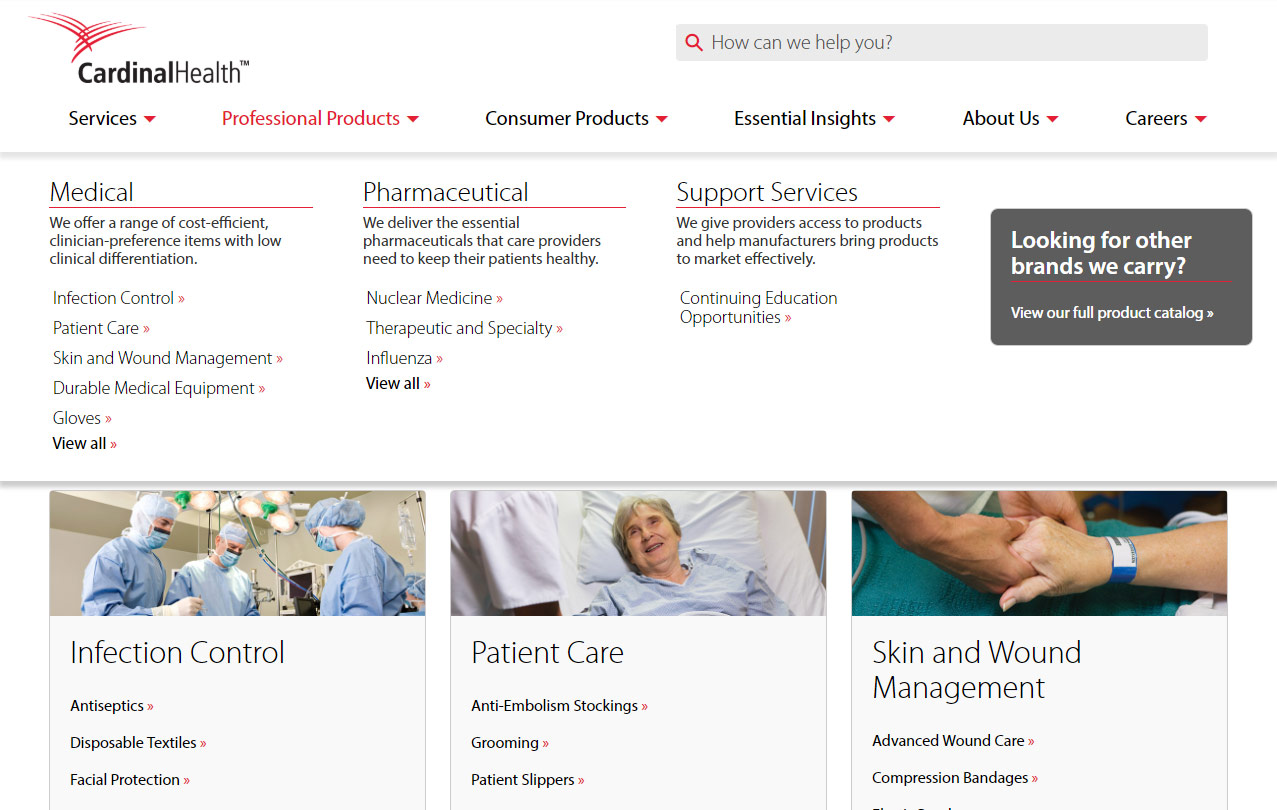
The original set of templates that were developed for cardinalhealth.com were intended to support multiple sections of content: product, services, careers, and corporate. These templates were intentionally broad in their structure, making it difficult to create a tailored experience for any one of those sections. This was especially challenging knowing that a product wayfinding experience is inherently different than that of a services experience. The existing template set blurred the lines between these two content types, creating a sub-par user experience overall.
We performed an audit of the existing templates and broke down the elements within each one – how were we seeing users interact with them, conversion rates on actionable items and the flexibility each lent to the established components that should be leveraged within them. Our audit and analysis determined one of the seven templates should be retired and two of the other templates should be enhanced to improve conversion performance.
Category child navigation grid reconciliation
The category templates used throughout the website had a navigation grid baked into the bottom portion of the page. This grid reflected the children pages that live immediately below that page. Similar to the challenges we had with the page template structures, the child navigation grids also needed adjusting. There were four variations of the child grid navigation, creating a visually inconsistent experience which did a poor job of progressively stepping the user through the IA.
After conducting an audit and analysis of the existing child navigation grids, we determined two of the versions should be retired, two should be enhanced to visually build off one another, and a new third version should be designed to represent the highest pages within the IA.
Usability testing
Early on in the exploration process, we developed a prototype reflecting our enhancements to help expose any experience gaps. Leveraging a group of internal testing participants, my team conducted a series of usability tests using this prototype throughout the project.
During the usability testing we uncovered multiple areas within the primary navigation that required adjusting. As users would move across the columns horizontally, the narrow height of each item and the short delay of the hover states were making it difficult for users to maintain their desired cursor path. After increasing the height of the navigation items and increasing the delay in the hover state between elements, we conducted additional testing to confirm the alterations improved the experience.
Original and updated product template flow

Result
142%
form fill increase
44%
pageviews increase